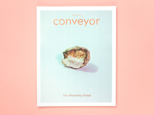
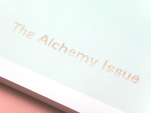
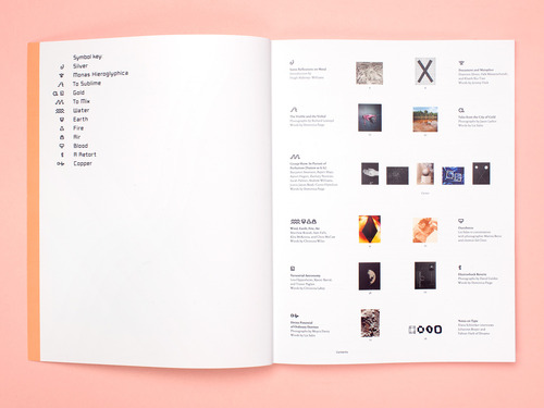
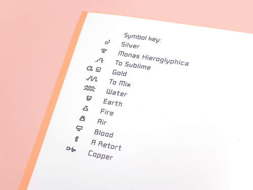
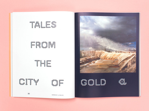
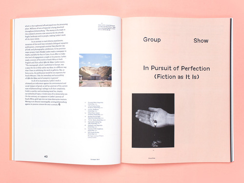
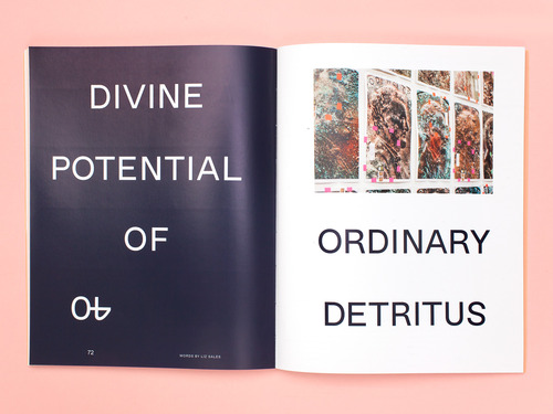
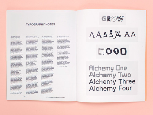
Responding to the issue’s theme, Alchemy, I commissioned designers Johannes Breyer and Fabian Harb of Dinamo to develop a typeface that would undergo an alchemical-inspired transformation. The result is Conveyor Favorit, which evolves in four stages—referencing the four stages of the magnum opus, an alchemical process for producing the philosopher’s stone (a substance believed by alchemists to turn base metals into gold and thought to be the essence of perfection). Further inspired by alchemical codes and symbology, we also created a series of symbols, each representing a different article in the issue. In contrast to the contemporary typography, the rest of the issue’s design remains understated, allowing photography to come to the fore while creating a sense of balance and centeredness in a nod to the alchemical fascination with perfection. - Elana Schlenker
Copies Available Here: www.conveyoreditions.com

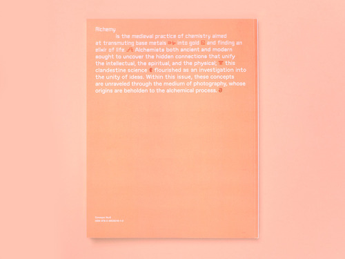
** Photos Courtesy of Elana Schlenker
Posted 3 months ago and has 23 notes#Conveyor Magzine #thealchemyissue #Elana Schlenker #Dinamo